About the Client
Shadi Hamid is a columnist for The Washington Post, co-founder of Wisdom of Crowds, and a leading political thinker known for grappling with the uncomfortable truths at the heart of democracy. With over 2,000 engaged subscribers, The Agonist is his independent newsletter—a home for first drafts, provocative ideas, and “contentions” that don’t fit neatly into the pages of legacy media.
The Vision
When Shadi rebranded his newsletter to The Agonist, he needed a design identity that could hold the weight of intellectual rigor while remaining modern and digitally native. The brand needed to reflect his core philosophical stance: that democratic conflict is inevitable—and even desirable—when channeled within principled limits.
Design Concept
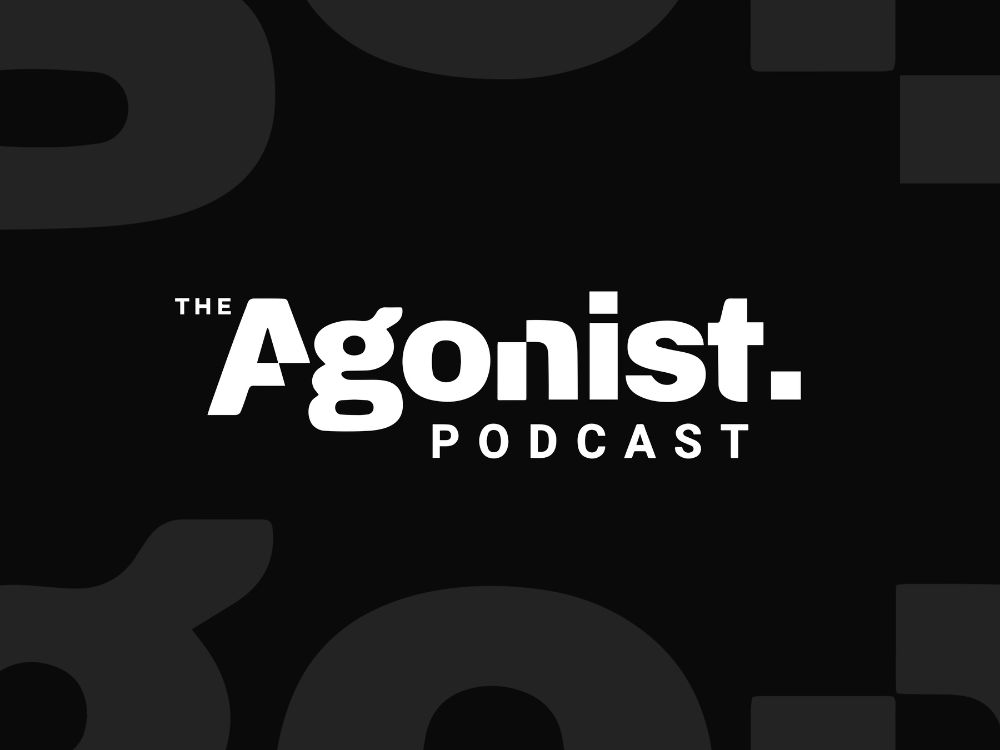
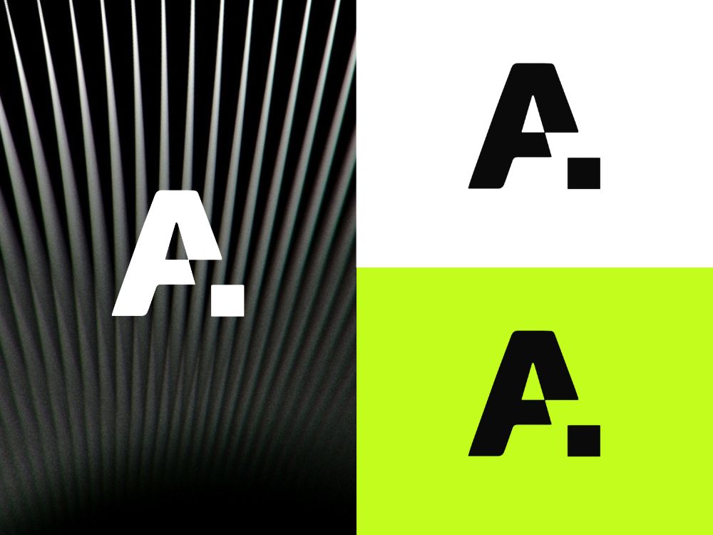
The word Agonist comes from “agonism,” a political philosophy rooted in constructive conflict. This tension became the heart of the design. I chose a bold, uncompromising type treatment: one that feels modern, serious, and assertive, with just enough asymmetry to suggest friction and energy.
The period at the end of the wordmark adds a sense of finality—almost like a dropped mic after an argument. It underscores Shadi’s conviction while keeping the tone editorial.
Agonism is a somewhat obscure philosophy of democratic conflict and competition, drawing primarily on the theories of the Belgian philosopher Chantal Mouffe. An “agonist” is someone who believes that political conflict and antagonism between friends and enemies is inevitable but that this conflict can (and should) be channeled through democratic competition.
Design Awards:
This design won October’s Best Logo Design Awards on DesignRush in 2025

Typography & Symbolism
The “A” in Agonist is custom-drawn—sharp, angled, and declarative. It plants its flag unapologetically, echoing the spirit of principled dissent. The curves in the “g” offer a counterpoint: a reminder that within conflict, there can be nuance. This visual dualism mirrors the philosophical tension between disagreement and democracy.
Color & Atmosphere
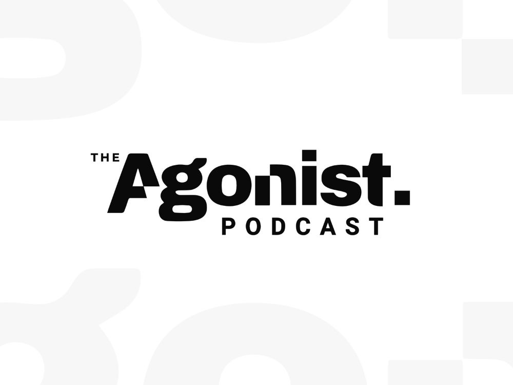
We kept the palette simple and stark: black and white. No distractions. No embellishment. Just clarity. The dark background evokes a digital salon—serious, focused, and reflective—while the white text punches forward with clarity and confidence. This contrast isn’t just visual—it’s philosophical.
Application
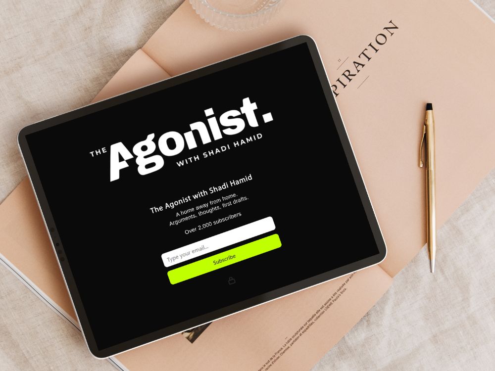
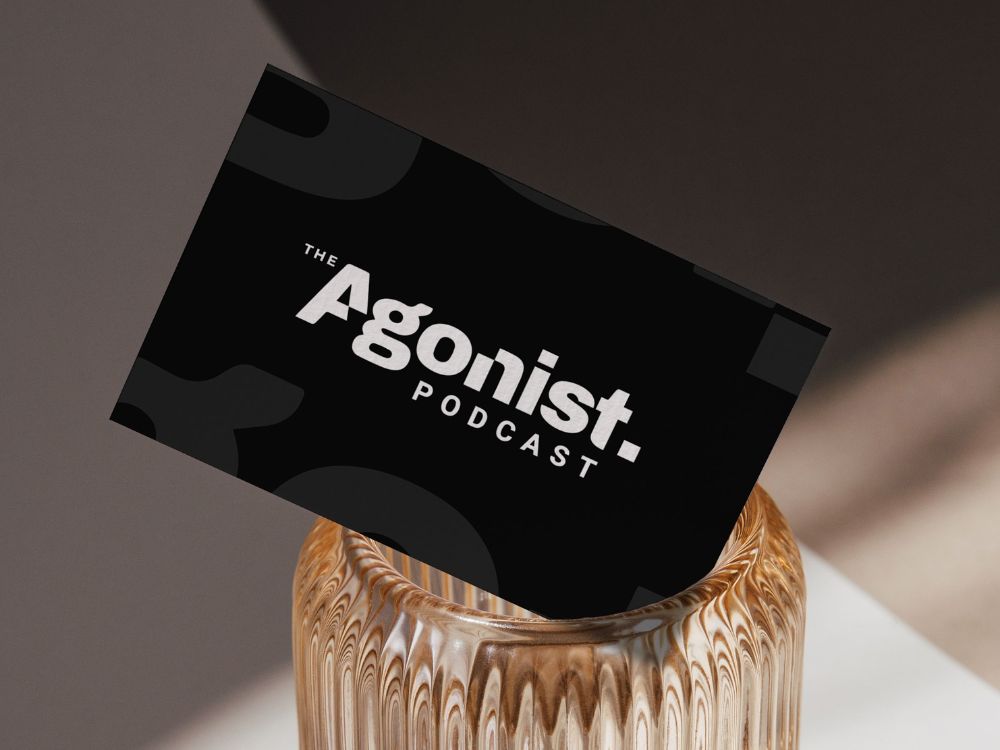
Whether used on Substack, in podcast art, or cited in articles from The Atlantic or The Washington Post, the brand holds its shape. It asserts itself without arrogance and invites engagement without diluting its point of view. It stands for something.
Client Praise
“A big thank you to Tara Slade | OmniBrand for designing the logo and branding for this newsletter.”
— Shadi Hamid, The Agonist