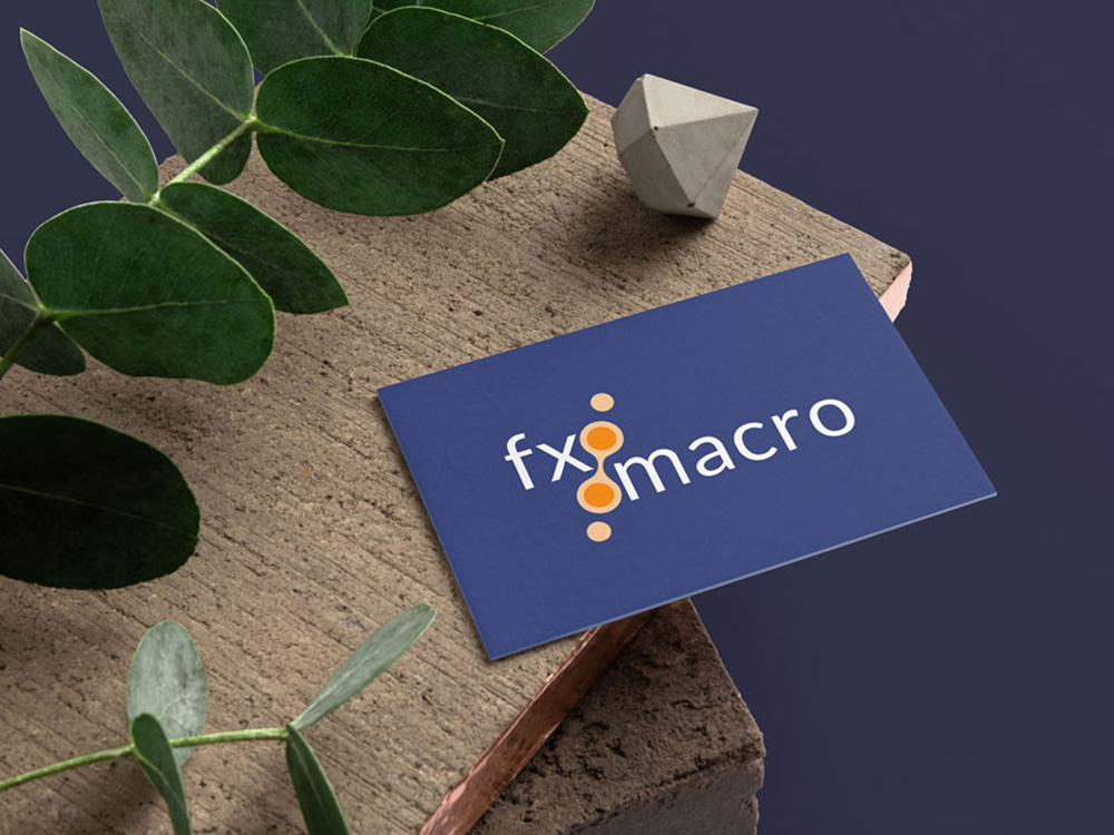
In July 2022, the mysterious FXMacroGuy (who prefers to remain anonymous), reached out to me to design a brand for his Substack publication FX Macro. He is an experienced trader based in New York and his newsletter is aimed at traders and finance professionals, offering a comprehensive review of market events, week by week. By using a variety of data sources and viewing the market from multiple perspectives, FXMacroGuy pieces together a coherent picture of the current state of currencies and economics.
“It’s more art than science, like solving a complex puzzle” he told me during the brief.
The content of FX Macro is fact-driven, filled with charts and data, avoiding any lengthy commentary. This approach is designed to be straightforward and useful for its audience of traders and finance professionals. We wanted the design to reflect this.
FXMacroGuy wanted the design to reflect professionalism, incorporating bright and fresh colors to capture the energy of the financial markets, while simple shapes subtly suggesting movement and interconnectedness, mirroring the dynamic nature of the financial landscape.

