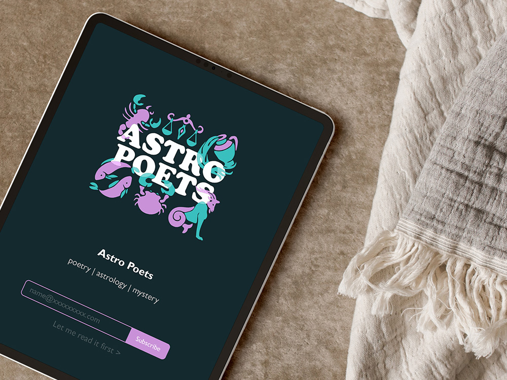
Astro Poets, the brainchild of celebrated poets Alex Dimitrov and Dorothea Lasky, merges the mystical world of astrology with contemporary poetry, creating a unique cultural phenomenon. For their brand, it was essential to capture the essence of both astrology’s timeless mystique and the playful, accessible nature of their work.
Design Concept:
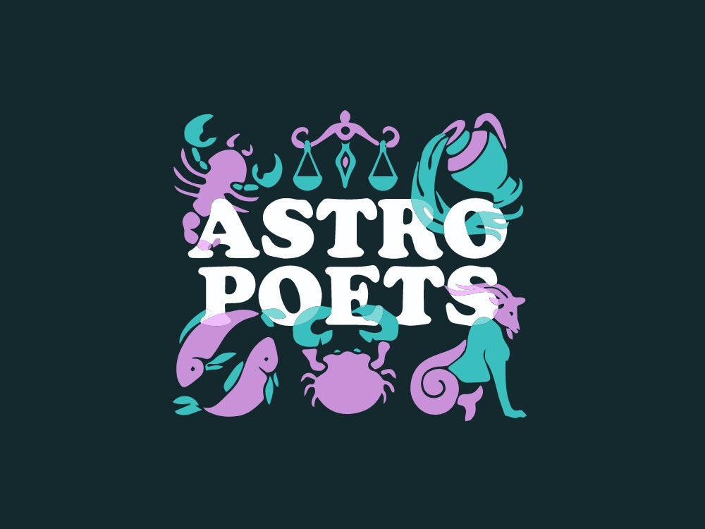
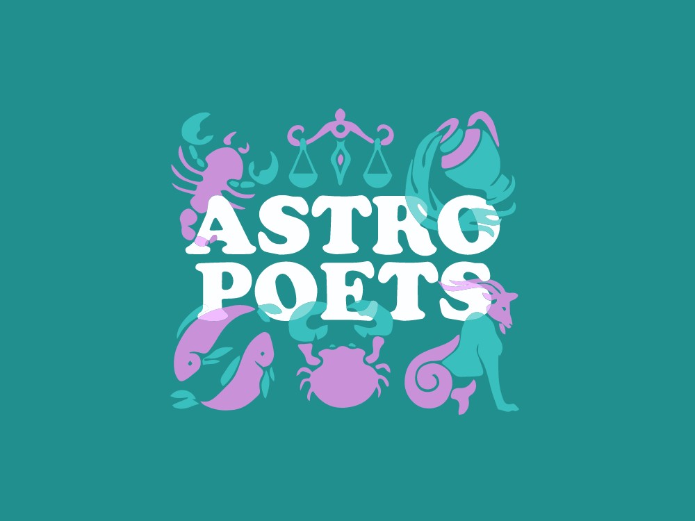
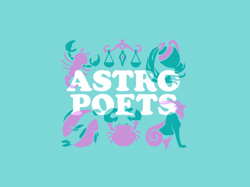
For the Astro Poets brand, I embraced a bold and playful aesthetic that reflects the lively and engaging spirit of their project. The typography is bold and rounded, adding a sense of fun and approachability, which mirrors the Astro Poets’ blend of wit and wisdom. The font choice sets a tone that is both modern and inviting, making it clear that this is a brand that doesn’t take itself too seriously, despite the depth of its content.
Symbolism & Structure:
Central to the design is the use of astrological symbols, which are integral to the Astro Poets’ identity. I placed six zodiac signs above and below the main lettering, forming a square that encapsulates the brand’s name. This structure not only creates a balanced and cohesive design but also visually represents the connection between astrology and poetry, two seemingly disparate elements that the Astro Poets have seamlessly intertwined.
Color Palette:
The color palette combines classic black and white with bright, playful hues, reflecting the dynamic and engaging nature of the Astro Poets’ work. The black and white elements ground the design, lending it a sense of sophistication and timelessness, while the vibrant colors inject energy and fun, aligning with the brand’s aim to make astrology and poetry accessible and enjoyable for everyone.
Design Inspiration:
The overall design was inspired by the need to create something that felt both cosmic and contemporary. By blending bold typography with astrological symbols and a playful color scheme, the design captures the essence of Astro Poets: a brand that is as intellectually stimulating as it is fun and approachable.

